Two weeks have passed thinking about the process of photo editing based on some high contrast photos that I took in the country side.
I thought to my self that it should be an article based on teaching with specific steps or, bricks of knowledge, with the intention on a clear understanding of what do I want to transmit. Obviously I had no clear idea about it, so I just started to postpone. To say it in other words, to procrastinate.
While concern about my intention in regards to photography, and coming back and forth thinking about the article, I realized something about this process or state that I found my self in.
What I know for sure is this:
- I do not know what I am searching for.
- I do not know what I want to achieve with my photos.
- so, I do not know my target
Starting this process of searching for my goal, I realized that I would like for others to see and feel same way as I do when I am looking at my picture. I would like others to have the same feeling as mine the moment I am pressing the shutter of my camera. I want others to have my exact experience. But it is still something unclear about it, or is too general. This is something I will want to reflect more.
For the moment I thought this: How can I find what I am searching for ? The answer: Experiment, document the process, reflect, analyse and move to the next experiment until I am happy with one thing.
The idea is not to let myself thinking about what I want, but rather to start experimenting things that I have inclination for, and then deciding if I like it or not. Hopefully, this trial and error process will eventually have one experiment that I like.
Having had this psychoanalysis I decided to write about by experiment in photo editing and my outputs even through I am not happy with it.
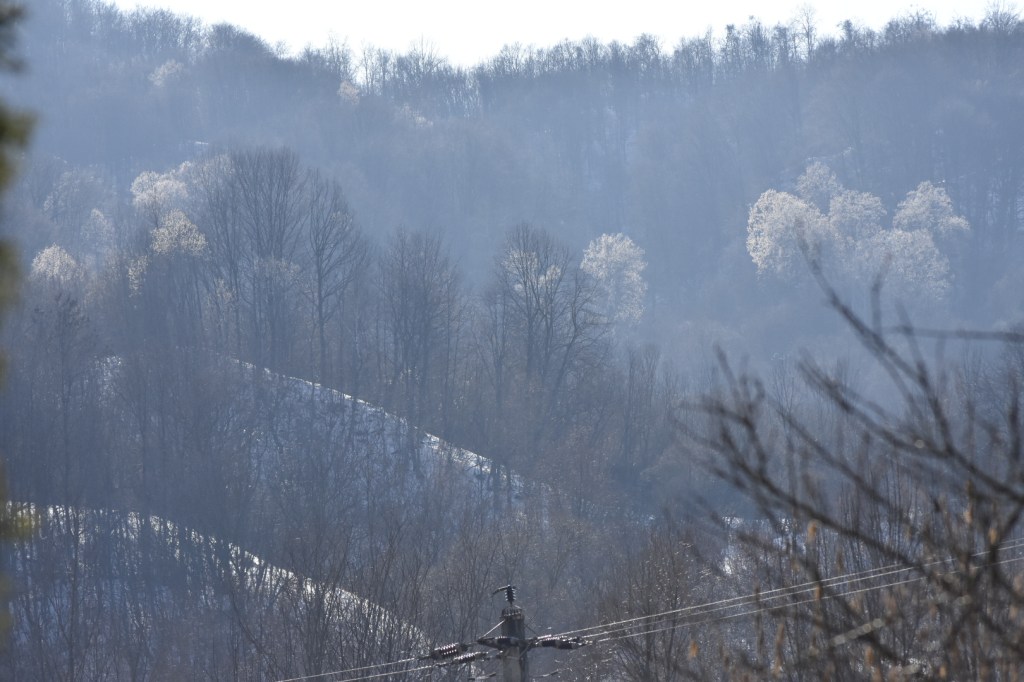
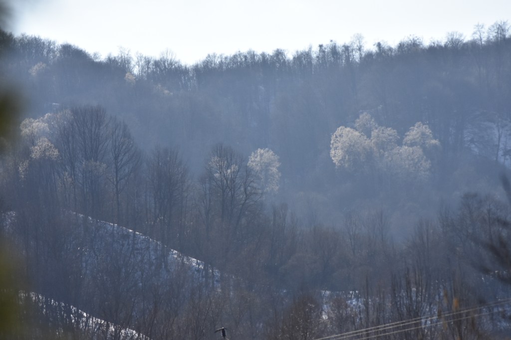
Photo description.
Why I have taken the photo in the first place ?
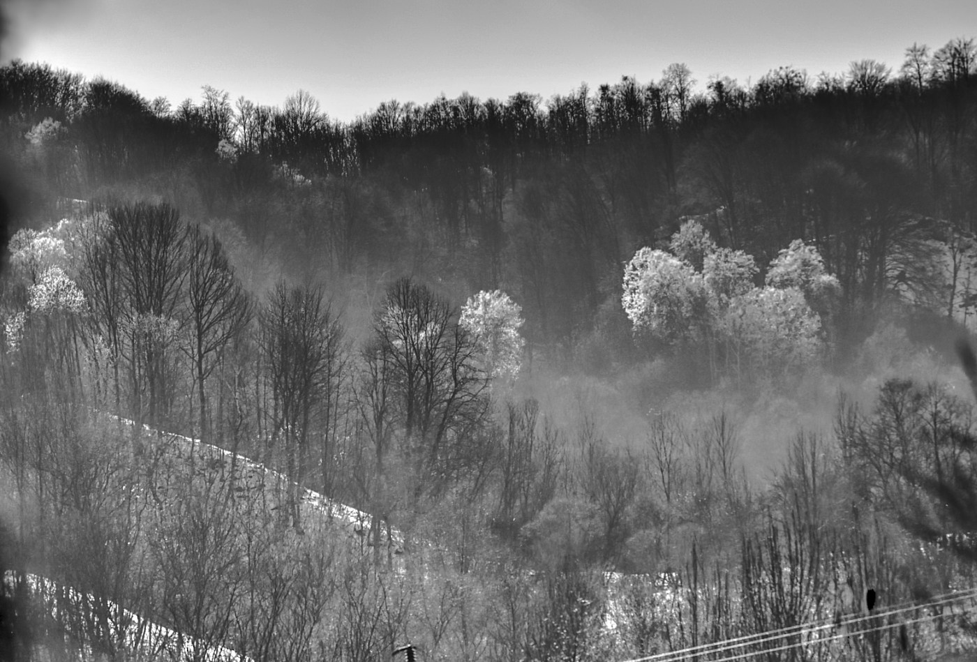
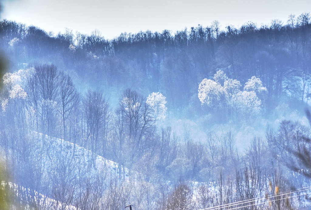
It was one hour before the golden hour in middle of March and I saw some of the trees in distant forest that were diffusing this white light in contrast with their surroundings. The light was caused by the white flowers in their corona. The shadows that the trees cased were aligned downhill as the sun was setting behind the forest hill. I see now that this detail is not capture in the photos. Also present was a haze visible I think because of the sun low altitude that was observed in between the trees. In my photo this is more visible in between the foreground( middle – left) and background trees in upper right. I liked the curves in white given by the snow in the lower left, as they make a frame around the distant white trees. I thought about to have more photos with different exposure as to extract more information from shadows, either by increasing the exposure in post processing or even try a HDR.
The subject of the photos are the trees with flowers. I liked the light diffused by those trees.
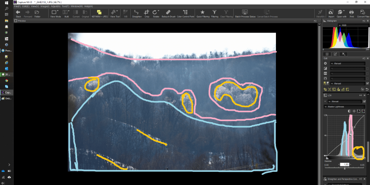
In editing the picture I based the analysis on the histogram.
The shadows are in blue zone, the mid tones are in pink zone and with yellow the upper middle tones – the trees with flowers. The zones are marked in the histogram with same colors. There are two hops that represent the blue and the pink zone, followed by the yellow zone.
In real life I liked the haze, but here I tried to get more clearness from the picture because I was not happy with the haze. One way of getting more sharpness (clearness) is to increase contrast. So with the help of histogram I did two things.
First I tried an S-curve for Blue Channel (from RGB) making the blues in shadow more prominent.
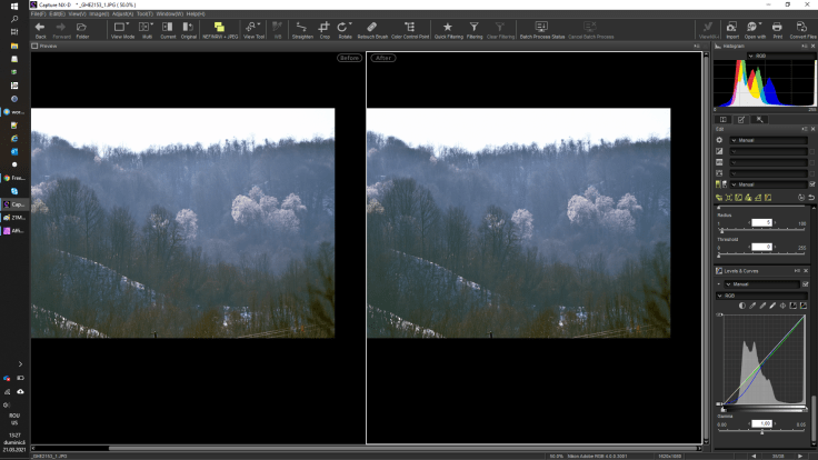
I was OK, but wanted more contrast, so I tried to have a stepper curve for the background and a lower curve for foreground. So, the first hump (blue zone) has the curve line traversed in more lower angle. The same curve is passing trough the second hump (pink zone) at a higher angle. Lower angle means less contrast and higher angle means higher contrast.

For the second editing try I ended up with Black and White. Above is how the curved applied influenced the histogram from initial state in blue rectangle to final state in orange rectangle. The curved is decreasing the shadows even more until the histogram is pushed all way to black limit. Is also decreasing the contrast for the forest in the foreground. What I observed is that for photos with lot of detail (like a forest) or for for situation were I do not like my photos, I can try a black and white option that just looks better than with colors.


Leave a comment